Monday, 26 January 2009

Narrative Structure


I've been taking an Evening Class at LCC in Narrative Structure, and one of the things we've been working on is producing a series of images to accompany a children's story by Oscar Wilde, called The Selfish Giant, which is about a Giant that comes home to find children playing in his garden and chucks them out, building a high wall to keep them from entering. As Spring arrives, the children play among the blossom and flowers outside the wall, but in the Giant's garden it's still winter, no birds are singing, no flowers grow, and the Giant is all alone!

Last week we looked at using collage to create an image, and this is my first illustration, combining tissue paper, magazine images, hand-drawn elements on newspaper, and photographs. I'm interested in how the addition of collage can be used in my work, something I'm also exploring in the addition of textures into my computer-based illustration. Overall I think the composition may be a bit flat. I think I need to make the medium fit my drawing style, rather than making it restrict what I do, but as an experiment I think it has been interesting...

Saturday, 24 January 2009

"Egg, nest, house, country and universe"


This is my submission for the latest exhibition at Camberwell, jointed curated by MA Drawing and MA Designer-Maker (nope, I've no idea either...). I had some fun with this one! The theme for the exhibition is "Egg, nest, house, country and universe", a Victor Hugo quote, taken from Gaston Bachelard's Poetics of Space.

I played around with a few different ideas to begin with, trying to include all the elements of the quote, before deciding to focus on just egg, country and universe – although it could be argued that there are probably lots of houses and nests populating the Earth being cracked open.

I found the space background from doing a search online, and adjusted the levels and colours, and added a colour halftone screen to give the appearance of it being viewed on a monitor (and to hide the fact that the image was low resolution). I did numerous sketches to get the hands right, photographing my own hands for reference, and looked online for references of an egg breaking and the yolk falling. My initial idea just had an image of an egg being broken in space, but while working on it, I developed the idea so that the "egg" was the Earth, which I like.

I coloured the image using a combination of colour pencil, felt pen and some Photoshop work. I am very happy with the final work!

Thursday, 22 January 2009

Sketchbook Doodles 2

Just a few more quick sketches I did of some of my classmates during our (very early in the morning) discussion about our Research Papers...

"Disappearing"


The new year brings with it new exhibitions, and this is my submission for the MA Graphics exhibition at Camberwell. The subject of the exhibition is Disappearing. The title of my work is "Up In Smoke" and was inspired by the fact that when I looked through a selection of newspapers for reports on the situation in Palestine, I could find very little, but I could find endless columns about the comings and goings of multitudes of vacuous celebrities.

I created the drawing by hand and then scanned and coloured it in Photoshop, adding collaged newspaper articles into the smoke. I printed the final work on a sheet of newsprint paper.

Tuesday, 13 January 2009

Sketchbook doodles 1

Just a few sketches I did of a couple of my fellow classmates during the past 2 days while we've been doing our Mid-Point Reviews as part of our MA (...and yes, I was paying attention!!).


Thursday, 8 January 2009

The Man Who Drank Too Much Coffee - page 1 (mid-point review)


My main project for my MA is to produce an illustrated story book, based on my own narrative,
The Man Who Drank Too Much Coffee, a cautionary tale about the perils of consuming too much caffeine. Last term I did some preliminary work, establishing what my story would be, and doing some rough storyboarding, but for my Mid-Point Review, I wanted to dive in and begin work on producing an actual page.

Where my initial sketches and plans were more directed towards producing more of a picture book, with single full page images on each spread, after doing some background reading and research into narrative illustration, I wanted to be able to develop the character and story a bit more, so that the reader can begin to understand him a bit more. To this end, I've decided that my book will be a combination of comic strip style panels and larger images, to allow me to expand on certain areas where needed, and also so that the full page images, when they appear, will have more impact. I need to rework my storyboards to take in this new direction, but for now, I've produced the opening page, introducing the central character of the book.

I wanted to set up the main character as being someone who is rather lonely and as a result, consumed by his work. The opening panels show him working late in the office, and introduces his reliance on coffee to help him stay awake and work long into the night. I tried to add little details into the images to build on his character – the pencil on his desk in the first panel is chewed, to show his nervousness, and in each of the panels, he's surrounded by trembling lines, a hint to the effect the coffee is having on him.

In producing this page, I've developed the technique that I began to experiment with earlier (see Colouring experiments), combining hand-colouring with computer-based work to create more of a textured appearance to my drawings. After drawing the outlines by hand using pen, I scanned the image, and then applied the flat colour in Photoshop. After working out the basic image, I then added shading effects using a range of greyscale pens and ink pens, scanning these and adding them as layers to my computer file. I'm very pleased with how the results this has achieved, and feel it adds an extra dimension to my work.

I sketched out the overall plan for the page, and then worked on each panel as a seperate piece, building the composition in Photoshop to create the final page. In terms of colours, I've tried to keep to a relatively simple palette, using different shades of a single colour to build the backgrounds, and then letting the shading pick out the individual elements. The foreground elements are more colourful, but still keeping the range of colours as limited as possible. I like the effect I have achieved and the way in which the panels relate to one another. I've framed the panels with a black background which helps to bring the colours forward.

As the story continues, the Man heads home after spending five days in a row at work, not sleeping and drinking a LOT of coffee, and as we follow him home, he sees all sorts of wierd and wonderful hallucinations, a result of the increased level of caffeine over-stimulating his brain (I tried to foreshadow this slightly, by his visions of an angelic and devilish version of himself talking to him in the third panel on the first page).

I would like to continue using the same colouring effect throughout the book, but experiment with using other mediums to achieve the shading. My ultimate aim is to have produced enough of the book to be able to approach publishers with the complete plan for the book, plus a substantial amount of completed spreads, plus a cover proposal.

Monday, 5 January 2009

Happy Birthday, Arina!


It was my friend Arina's birthday this week, and I was thinking what to get her, when I found these DIY Russian Dolls in Magma, and because she's from Russia, it seemed "Purrfeckt"!

I decided to decorate them to look like some of her friends from our course. Initially I was a bit bemused about drawing on a 3D surface, so started off by taking a photo of the dolls and printing it out, so that I could plan the drawings. Having got an idea of how they would look, I got to work, first drawing the rough outline in pencil, and then going over it in more detail with a black ink pen. The surface of the dolls was good to work on, as it soaked up the ink, so I didn't have to worry about smudging it. I wasn't sure how I was going to be able to colour them, but after a few tests, I realised that felt tip pen was a good medium to use. The wood that the dolls are made from didn't soak up the colours too much and desaturate the appearance, and again, I didn't have to worry about smudging. I refered to various photos to get the right look and outfit for each character, and tried to add in little details that Arina would notice. I'm very happy with how they finally came out, although I wish I'd thought about how small the smallest doll was before I began decorating them, as it proved incredibly fiddly!!


Top row (from left to right): Arina, Elli and Me
Bottom row: Kazu and Miriam

Friday, 2 January 2009

Colouring experiments

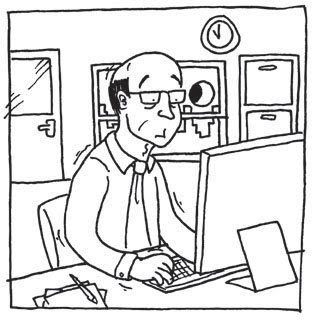
(1)


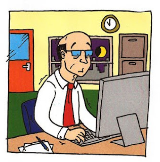
(2)


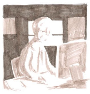
(3)


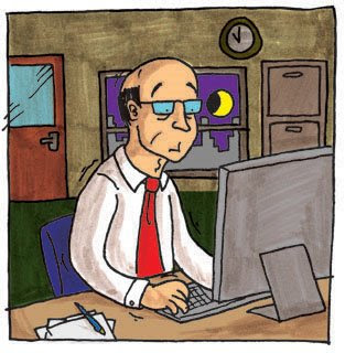
(4)


So I need to start work on my illustrated book for my part of my MA project. I wanted to try a new way of colouring my work to add some texture to my images. My normal way of working is to do my drawing by hand, scan it and then colour on the computer using Photoshop. While I like the effects I can create this way, I wanted to experiment with ways in which I can combine both the traditional methods of illustration and the computer-based elements.

I drew my line-art by hand using a black pen on paper, then scanned this (1), and then applied flat colour in Photoshop (2). Next, I took my original drawing, and put another piece of paper over it, and using a lightbox, applied shading using grey pens (3). Finally, I scanned this, and then added it as a layer to my Photoshop image, to create my final image combining both the hand-drawn and computer-based elements (4).

I'm pleased with how this looks, and want to develop it further as part of my MA project...