Friday, 26 December 2008

T is for T-shirts...

Just before Christmas, I produced a few t-shirt designs and screen printed them myself at Uni. I really enjoyed doing this, and it was relatively simple – definitely something I want to do again. Here are a couple of work-in-progress shots:


And here are my final designs:


I also produced some other versions on different coloured t-shirts. This is definitely something I want to do some more of, and look towards selling them, either online or at a market...


Merry Christmas!

This year, I designed two Christmas cards to send to my friends and family. I drew the images by hand, then scanned them, and added colour in Photoshop, before printing them out on my printer...


Tuesday, 23 December 2008

Cover Versions

So I've entered the 2009 V&A Student Illustrator Awards. I had to submit three images of my own work, from my own selected brief. I decided to enter the images I produced for our course-led exhibition at college a few weeks ago. The subject was Cover, with the only stipulation being that the work must be exactly 12x12cm in size. I decided to interpret the subject to produce a series of "cover versions" of famous album "covers", and produced two pieces based on Nirvana's Nevermind, and The Beatles' Sergeant Pepper's Lonely Hearts Club Band, both highly iconic covers that regularly feature on lists of The Best Album Covers Of All Time.

For the competition, I produced a third piece, this time taking my inspiration from Blondie's Parallel Lines. I also slightly reworked my two earlier pieces. The deadline for the competition is 31 December and the 1st Prize is £2,000 ...and a trophy!


And just for any of you that may not know the original covers...

Saturday, 20 December 2008

Macavity – The Mystery Cat

A friend of mine asked me whether I could do an illustration for her featuring the poem Macavity – The Mystery Cat, by T.S. Eliot. When she was little she used to read it with her dad, and she wanted to have something she could frame and give to her baby sister for her first Christmas. It's quite a long poem, with quite a lot going on, so rather than illustrating a specific moment in the poem, I decided to draw a decorative frame around the poem, featuring Macavity, who is described in the poem as being tall and ginger, with uncombed whiskers, and movements like a snake – something I tried to capture in the movement of his tail. Because he's also depicted as a master criminal, I gave him a burglar's mask to hide his identity! Hopefully she'll like it...

Thursday, 18 December 2008

Creative Project - "That time of year... is December"


So, it's got nothing to do with my MA project, or my research paper, but f**k it, it's Christmas!!

Wishing you all a Happy Season...

Friday, 5 December 2008

The Ghost of Drawings Past: Episode Two

And lo, just as 2005 had beget 2006, so did 2006 in turn beget 2007. The year in which Bird Flu struck the UK – and didn't actually lead to the impending Apocalyptic disaster that the media forecasted (...although some sparrows did complain of a chesty cough); the Smoking Ban came into force in England, forcing millions of nicotine addicts to freeze their arses off outside, and Leon Jackson won X-Factor (...I have no idea who he is either!).
I also found these drawings that I did...


Get Well Soon:

An online greeting card I sent to a friend.

"Mmmmm, brains!":

A portrait of me as a zombie. I did this as a Valentine's Day cartoon – literally giving someone my heart!

Amy Winehouse:

They tried to make her go to Rehab, she went to the pub instead. Miss Winehouse's increasingly monolithic hairdo made her look more and more like an inebriated Marge Simpson...

Thom Yorke: Paranoid Android:

A drawing I did for the hell of it, depicting the Radiohead singer as a nervous robot, afraid about an imagined catastrophy. The background is scanned from the booklet to Amnesiac, with various Photoshop filters applied to it...

The Ghost of Drawings Past: Episode One

So I found a whole bunch of drawings that I'd done a couple of years ago, back in the dim and distant past of 2006, when I used to have a MySpace page, money was actually worth something, and Jonathan Ross was still employed – crazy times! Anyway, welcome to my little trip down memory lane...

Spongebob's Nightmare:

One of the first illustrations I ever posted online, slightly perverting a much-loved (by children and students) cartoon character. Possibly the result of too much alcohol...

The White Stripes:

I used to love The White Stripes and saw them live at the Reading Festival and in Alexandra Palace. They're last album, Icky Thump was a bit...odd, but this was when they still had a place in my CD player (I don't think I'd actually bought an iPod back then...)

Euro 2006:

Yes, football! Some of you may be surprised to see that I actually drew a football-related picture, given my general disinterest in 22 overpaid idiots running about on a patch of grass for an hour and a half, and failing to justify the ludicrous amounts of money they get for doing it, but I do at least show a passing interest during any International Competitions such as the World Cup, or European Championships (...well, at least until I resigned myself to the fact that England are useless at these things and will never ever win, despite occasionally managing to fluke their way through to the later stages of the competition, only to lose at penalties in the dying moments).


Anyway... this was done during Euro 2006. Some of the references may not be instantly recognisable to people now that enough time has passed, but these are my drawings of lanky, human bean-pole Peter Crouch, the Burns-esque Sven Goran Erikson, and professional neanderthal, Wayne Rooney, who had recently done a "controversial" poster ad for Nike.

The Mighty Boosh:

What a difference a few years can make. Back in 2006, the Mighty Boosh were actually funny, as opposed to the toe-curling, wannabe rock stars that they've become today. This was my drawing of Noel Fielding and Julian Barratt in costume as my two favourite characters from the second series, before they "jumped the shark": Old Gregg and Rudi van DiSarzio. I guess this is quite dated now, but I still quite like the drawing in this one...

Jimi Hendrix: the Original Guitar Hero:

After discovering the rainbow gradient tool in Photoshop, I decided that the best use of this Psychedelic colour generator would be a drawing of the poster-child for the Sixties: Jimi Hendrix. Not much else to say about this one...

Napoleon Dynamite:

One of my favourite films ever – a fact that is proven by the number of times I've watched the DVD – this is a drawing I did of the main characters from Napoleon Dynamite: Napoleon, Kip and Pedro. If you haven't seen this film already, go out and buy it NOW!

Monday, 1 December 2008

Colour in Time


...so this week's exhibition is being curated by MA Book Arts, with the title: Colour in time, Colouring in time, Colouring time. Unlike the previous exhibition subjects, I didn't really have any instantaneous ideas for this one. But then I thought of the "colouring in" and the idea of "time", and decided to produce a sort of colouring book page on the subject of time - people from various periods of history each contemplating a different form of time piece (...and a Back To The Future reference). Then I coloured it in using Crayons for that authentic colouring book feel.

I wanted to leave some of it unfinished to emphasise the fact that it was meant to be a colouring book - colouring-in time. I'm not sure if I've managed to completely convey the idea, but I like the overall composition...

Friday, 28 November 2008

"Almost an Island"


Hot on the heels of the Illustration and Digital Arts MA exhibitions is the latest student-curated show, being handled by MA Printmaking. Taking a slightly different stance from the previous shows, the starting point for this exhibition is the poem, The Drunken Boat by Arthur Rimbaud, with each participant choosing a different stanza from the poem to use as the basis for their work.

The piece I selected goes as follows:

I should have liked to show to children those dolphins
Of the blue wave, those golden, those singing fishes.
–Foam of flowers rocked my driftings
And at times ineffable winds would lend me wings.

My intial sketches and my main idea focused on the imagery within the poem of dolphins, waves, flowers and wings:


Having worked further from my sketches and developed the final drawings which I hand-coloured using felt tip pens and then scanned and composed the final image in Photoshop, I decided that I wanted to incorporate the text within my final piece. But rather than just adding the text using the computer, I decided to set the type by hand and print it using letterpress, then scan the finished result and add it to my final image (...I am Johannes Gutenberg).


Thursday, 27 November 2008

F is for...

After drawing my letter for the C is for Camberwell project that our MA group has been working on, I was thinking about continuing with my own illustrated alphabet as part of my Project Proposal. As luck would have it, this week's Creative Project subject was: "F is for...", and so I was able to kill two birds with one stone*...


F is for:
  • Fox
  • Full moon
  • Fence
  • Frying pan
  • Furious
  • F**k!
  • Giving the Finger
  • Frankenstein
  • Fancy dress
  • Flying
  • Fire
  • French bread
  • Fosters
  • Frozen
  • Fruit
  • Fungi
  • Fencing
  • Fork
  • Facebook
  • Flowers
  • Field

  • More letters to follow...
    *No birds were actually stoned during the course of this post

    Friday, 21 November 2008

    Super MAssive Blog Update part 2: MA Illustration

    So, I'm doing an MA in Illustration at Camberwell College of Arts, which is a lot of fun. Here's some of the work I've done so far as part of my course:

    Alphabet letter:
    We've started a group project among everyone on my course, where we each take a letter of the alphabet and illustrate it in whatever style we wanted. I signed up to do K, and after making up a list of words beginning with K, I decided to use Koalas as my main theme, and draw a load of koalas doing things beginning with K...


    For the record, the list of things beginning with K is:
    • koala
    • karate
    • kimono
    • kite-flying
    • karaoke
    • kipping
    • Special K (okay, maybe a bit of a cheat, but it was a good image...), and
    • Kiss (as in the make-up clad rock band)
    • I also used a kitchen for the background setting, and also drew koala'sknitting and knife-throwing, but they wouldn't fit into the final composition...

    I scanned all the individual images, and then coloured them in Photoshop and arranged the final composition. I enjoyed doing this, and might actually create an entire alphabet as one of my side-projects during the course... watch this space!


    Website:

    I took a series of Dreamweaver courses to learn how to create my own website using tables. I really enjoyed it, so much so that I've now gone into full-geek mode and am learning how to create my site using html and css. Here are some screen grabs of how my site is currently looking, before I've carried out the coding, but it's close to how I want it to look. As soon as I'm done learning html, I'll be buying a domain and putting it live, until then have a look at this:

    My home page - I created the lettering by hand...

    About me - I made a cartoon of myself to introduce myself. (when you're in a section, the text becomes black)


    Sample gallery page - the images all fall from a set drop point, and the arrows at the top enable you to move forward and back...


    Contacts page – I created three illustrations for my postal address, mobile number and email address.

    Drawing A Lecture:

    This week's exhibition is being curated by Digital Arts, and the subject is "Drawing A Lecture. I decided to scan all of my extremely extensive (ahem) notes from our Wednesday morning lectures, and then create a collage of sorts in Photoshop, adding drop-shadows to layer the individual pages, like so...


    Lucky that I often use different coloured pens when making "notes", and also that I pay such close attention to what is being said... (ahem!)


    I'll be attempting to keep this blog updated more regularly from now on, so stayed tuned for updates... probably...

    Wednesday, 19 November 2008

    Super Massive Blog Update part 1: Creative Project

    Okay, so we had a talk this morning about blogs, which got me thinking, "I should really update my blog!", so here we are...

    I've got stuff I've been doing for my MA course which I'll post in a moment, but first I thought I'd stick up my entries for Creative Project. For anyone that doesn't know, Creative Project is a Facebook Group set up by my friend Cathy Sison, where every 2 weeks, she posts a new subject with the aim being for everyone to post their own creative responses. It's good for giving my creativity an (often much needed) adrenaline boost, as well as producing some new work for my portfolio. 

    Ghosts:


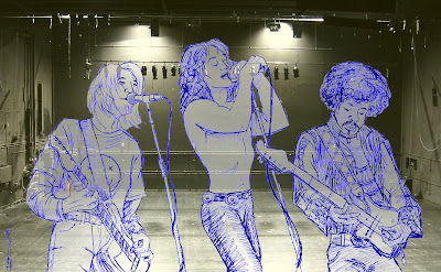
    For this one, I decided to draw the Ghosts of Rock: Cobain, Morrison, and Hendrix (who all died at the age of 27!). I drew the figures using a blue biro from reference images, and then scanned them and added an 10% white layer in Photoshop, before dropping in a stage background that I found online and desaturated.


    Magic:


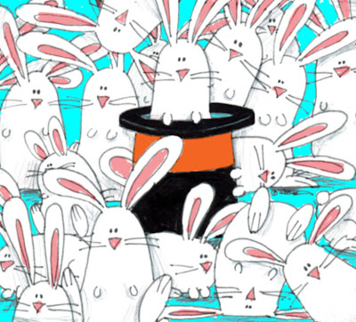
    I did this one quite quickly, as I was a bit stuck for time. Fairly straight-forward: what's more magical than a pulling a rabbit from your hat? How about lots of rabbits! 


    Superheroes:


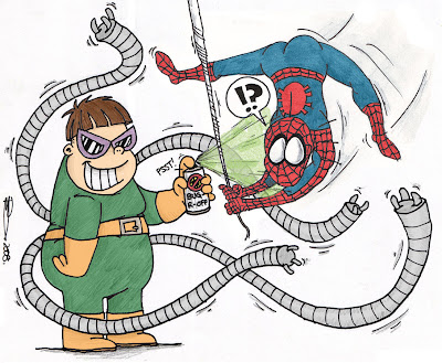
    I actually went back to a drawing I'd done while I was doing my BA for this one. I'd drawn a cartoon for a student magazine to illustrate an article about the glut of movie sequels being released (Men In Black 2, Spider-man 2, Scooby Doo 2, Stuart-freakin'-Little 2!!!). I took the image of Spider-man I'd drawn, and scanned it, added colour to the black & white original, then drew Doctor Octopus in the same style, and ta-da! 


    ...In search of a sunrise:


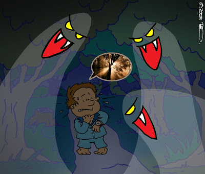
    I wanted to do something different from all the (admittedly very beautiful) photographs of sunrises submitted by other people. I opted for a small boy, having a nightmare featuring ghosts in a forest, and searching for a sunrise so that he can wake up. I sketched out the image, scanned it, and then – in a slight change from my normal way of working – traced over the drawn lines in Photoshop using the brush tool. I did this to try and get a shakier line to my drawing, to give the drawing a slight dream-like quality. I created the ghosts in Illustrator using anchor points to create a curved appearance (...and because I'd just had an Illustrator workshop that morning). 


    You are what you eat...:


    I took a slightly different approach to this topic, creating a comic strip. Taking my cue from those people that look like their dogs (you know the ones!), I thought of people literally looking like their food. Poor Pizza-face!


    More updates very soon...

    Tuesday, 29 July 2008

    Sgt. Merrell's Lonely Book Club Band

    So I'm leaving my job as a designer at a book publishers at the end of this week in preparation for starting my Illustration MA in September. Here's the final leaving card I drew before I went, for our US Director, with drawings of my fellow colleagues, plus a collage featuring some of the people and images that have appeared in the books I've worked on during the last four years. Obviously this is a sly nod to Peter Blake's cover to The Beatles' Sgt. Pepper album.


    Tuesday, 8 July 2008

    Keep on running...

    So my brother is taking part in some sponsored run thing at the weekend and asked me to draw him a picture he can have printed on to a t-shirt to wear during the race. I came up with this design, based on the poster for the film Run Lola Run


    Tuesday, 6 May 2008

    Creative Project (week 3)

    "Someday... I will fly away"

    This latest quote has really got my mind racing! So many thoughts and ideas going around in my head. I might actually do more than one entry for this one (if that doesn't make me look too greedy). For now, I've done a piece called When I Grow Up, I Want To Be..., with a baby penguin who longs to be able to fly and head for sunnier surroundings.


    I drew the penguins quite quickly using a black felt tip, and then scanned and coloured the image in Photoshop, adding the background scenery. The airplane was from a stock image that I reduced in size and added to give a collage effect.

    Sunday, 27 April 2008

    March of the Angry Ferret

    A mate of mine is working on a techno track called "March of the Angry Ferret", and asked me to do some artwork for him to stick up on his website once the track's complete. I think it's fairly self-explanitory: I utilised the copy and paste function to save myself contracting RSI...

    Tuesday, 22 April 2008

    Creative Project Week 2

    I'm loving this! This week's starting point was a lyric:

    "Dust gathers on my stereo... cause I can't bear to hear the radio" (one Google search later, I can tell you that this is from I'm Scared by Duffy)

    This struck me as quite a melancholic rhyme, and I imagined a once loved radio now discarded. Perhaps usurped by the latest MP3 player. Funnily enough, it kind of tied in with my Radiohead character from the CD artwork I'd recently produced (see my earlier blog, below), and I jotted down a quick sketch on my notepad at work while it was still fresh in my mind...


    When I got home, I worked on the final piece based on my sketch. I decided to draw using a charcoal pencil to give a rougher, harsher appearance to the line work. I worked on the various elements separately and then scanned them in and developed the final composition in Photoshop. I then coloured the image using various layers...


    However, while I was happy with the drawing and the composition, I felt the colour didn't really help the mood of the image. I converted the picture to greyscale, removing the colour information, and changed the text colour to white with a slight drop shadow. I feel happier with this as a finished piece...