Sunday, 30 March 2008

Illustration course part 5

Day 3, and we were set a brief to create an illustration based on the short story The Snow Child, by Angela Carter. The story is about a Count and Countess who are travelling on horseback through the snow, when they discover a beautiful girl with skin as white as snow, hair as black as a crow's feathers, and lips as red as blood. The Count is instantly taken with the girl which makes the Countess very angry. She keeps trying to get rid of the girl, but the Count keeps stopping her. Finally, the girl goes to pick a rose for the Countess and pricks her finger and melts away to nothing.

Reading through the story, I was taken with the repeated references to red, black and white in the text, so wanted to use those three colours in my final piece. The dark undercurrent running through the story, combined with the very visual imagery, made me think of a lot of Japanese and Korean films. With these ideas in my head, I began looking through a whole host of magazines that our teacher had bought in for us to collect ideas from. I found this method of creating ideas very useful and something I will definitely incorporate in my future work.

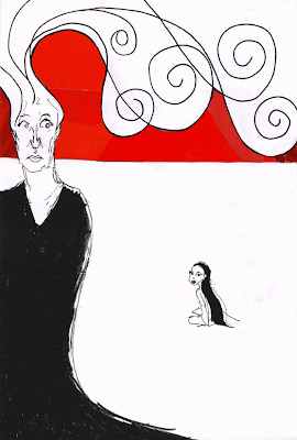
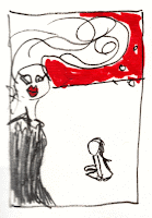
Having collected a variety of images, I played around with some ideas and collages to create the basis for my finished piece. After talking with our teacher, she suggested I try to use the drawing style I'd developed the previous day to create the various elements I'd suggested. Below is a quick thumbnail sketch of the image I wanted to create, based on images I had collected. The idea was that the Countess would be large on the page, her hair sort of extending into the scenery to create sort of wintry, cloud-like shapes, while the Snow Child would be quite small in contrast, sitting naked among a large expanse of pure white snow. I wanted to have the horizon quite high on the page, and use red in the sky to symbolise the sinister elements within the story.

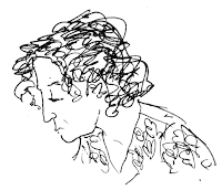
After a few unsuccessful attempts to draw from the photographs and images I had collected, the next day I decided to go back to drawing from life, using some of my classmates as the basis for my characters and then developing the images slightly to fit with my picture. This next drawing is based on a pose that I found in a magazine. I liked the rhythm of the lines in this picture...

I was then stuck with depicting the Countess, and eventually worked on making some reference sketches from observing another of my classmates, adding in my own flourishes, so that it wasn't a completely literal drawing of that person. I felt the sketch on the right in the image below fitted better with my drawing for the Snow Girl...


Taking these elements and pasting them up on my page, I made some copies so I could play around with the image a bit more without worrying about spoiling the final thing. For the Countess's hair, I wanted to retain some of the freedom and spontaneity of my initial thumbnail sketch, so I took my eyes off the page while drawing the circular patterns (this is where it helped to have a few copies to play around with).

For the red sky, I initially blocked in the colour using a marker pen, but something about it didn't feel right. Using a technique I had seen one of my classmates using, I decided to make up the colour from scraps cut from magazines, to add another texture to the page.

I was pleased with the final piece and feel it manages to capture the essence of some of my drawings from earlier in the week, as well as illustrating some of the themes and relationships from the story...

Illustration course part 4

Day 2, and I was going around the college making drawings and collecting ideas for a piece based around the course itself. As it was the Easter holiday, the college was pretty deserted, so I wandered around the empty rooms and hallways making quick sketches of interesting shapes and angles I discovered...

I also found this stained-glass window in one of the stairwells, which was a bit spooky-looking (and reminded me of the haunted painting from the film Ghostbusters 2). I also liked how it was in complete contrast with it's surroundings, so I made a quick record of it using crayons to try to capture the colours...
Next I decided on a slight change of tact, and had a wander around some of the studio spaces upstairs. Again these were completely deserted, but students had left all their work out in the process of putting together an exhibition. Walking around I discovered a mirror that someone had left placed on an easel. I decided to do a self portrait of myself in the studio...
...I was really pleased with how this came out. I went straight in with a blue roller ball pen, rather than making any pencil sketches first. Another thing that differed from my normal drawing style was the fact that I was standing up resting my sketchbook in my arm, rather than sat at a flat surface. I really like the spontaneity and expressiveness that this gives to the line work. It also made me see that although perhaps technically some of the drawing isn't "correct", it definitely captures a moment and has a definite feel to the drawing.

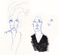
Getting back to the class before we reviewed the work we'd done that morning, I felt boosted by this new style to my drawing and as we were still waiting for a few people to come back, I used the time to make quick 3-minute sketches of some of my classmates while they were drawing. Taking what I'd discovered from drawing my self-portrait, I worked straight in with a black roller ball pen, and sat with my sketchbook resting in my hand...
I was really finding drawing straight in pen to be a liberating experience in terms of my line work, and being bolder with my drawing. When I made mistakes, rather than reaching for the rubber, I just reworked the image to get the shape or angle, and felt that my work was better for that. After lunch, I decided to carry on exploring this approach and drew the rest of my classmates as they went around the college drawing...

I want to work all these elements into some kind of finished piece. I discussed my ideas with our teacher during the course, and have a few ideas that I am going to work on developing further.

Illustration course part 3

Taking one of my previous drawings, I played around on the photocopier to reduce and enlarge it and see what interesting accidents I could stumble across. Then I looked at applying colour to my work.

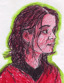
For this piece, I reduced my original image by 75% which created a really fine line from my original pencil drawing. I then applied a monochrome colour palette to the face, placing different surfaces behind the paper to create different textures.


Next I super-sized my meal, and enlarged my original image by 200% and then enlarged that copy by 200%, which really thickened up my line work and made it look like I'd drawn the picture in charcoal. It also resulted in a really cool (albeit completely accidental) crop to my image on the page. I then used a limited palette to pick up the highlights and shadows in the face.

Illustration course part 2

Next up was drawing from life. We took it in turns to model for our fellow classmates and started off with a 15-minute pose (which feels like an absolute eternity when you're the model)...


This next one was an extended 30-minute pose, which meant I was able to work in a lot more detail...

Illustration Course part 1

As some of you might know, I enrolled on a four-day illustration course at Camberwell College of Art last week, which was all kinds of awesome and really reignited my creativity again!

Spurred on by this personal renaissance, I thought I'd share my efforts with the world through the magic of the Internet (isn't technology marvelous?)...

First a few 10-15 minute drawings of different shoes from life...


We had slightly longer for this last one, so I tried drawing it from a variety of angles, and experimented with using a blue Biro to draw with, which created quite a nice effect.